
 Keeping-your-customers-in-the-loop-...
Across the world, COVID-19 is quickly changing how countries and individuals function. Stress is at an all-time high, and it can be challenging for people to navigate through their now-different lives. During these times, businesses have to ensure that their crisis messaging is both clear and easy to follow.
Just think about how frustrating it is to find out about product and services changes at the last minute. Have you ever checked a store’s hours before visiting, only to find that it was actually closed when you arrived? Have you ever reached the last step of checkout only to find that certain items will take an extra four weeks to ship? These pain points existed even before the pandemic, but it’s even more of a priority now to proactively address these user frustrations. Remember, your users should be informed, not surprised.
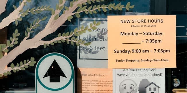
One of the best ways to inform your users is by optimizing your website’s UI and UX. Not only will these type of improvements make it easier for your users to stay up to date—they can also help free up resources by minimizing repeat inquiries from customers. With that in mind, here are four simple steps to help you curate a seamless crisis messaging experience.
-
Determine what your customers should know
This first step is foundational to the rest of your crisis messaging: creating the informational framework your users will eventually reference. Will your company continue to halt all operations? Will you reduce regular services or adjust business hours? Will existing subscriptions be frozen or canceled? Make sure that everything that is relevant to your customers is outlined.
Also note down any initiatives that your company has started or is taking part in. What are you doing to help your employees stay safe? Are you involved in a community fundraiser? It can be reassuring for customers to know that you are taking the situation seriously beyond just your internal operations, and that you doing your part in a greater global cause. Just make sure that your tone is empathetic and helpful, instead of coming across as bragging or haughty. This is also a great opportunity to add COVID-relevant content to drive traffic and increase time spent on your site.
-
Place your notice where it can be easily found by users
Once your message has been outlined, you’ll need to put it somewhere on the website. It’s a good idea to have a global element that is unlikely to be overlooked—such as an information bar—so users can see it regardless of which page they land on first. If your message is only placed on the homepage, users who are redirected from another page or search engine may miss it entirely. As people visually scan a page from the top down, we recommend that this information bar is at the top of the page, instead of as a footer or a floating sidebar.
Now, we’re not saying that having a message on your homepage is bad, but it is sub-optimal when used on its own. A hero banner can help complement your global bar, with the former being more visual and narrative-driven, and the latter being more straightforward and concise.
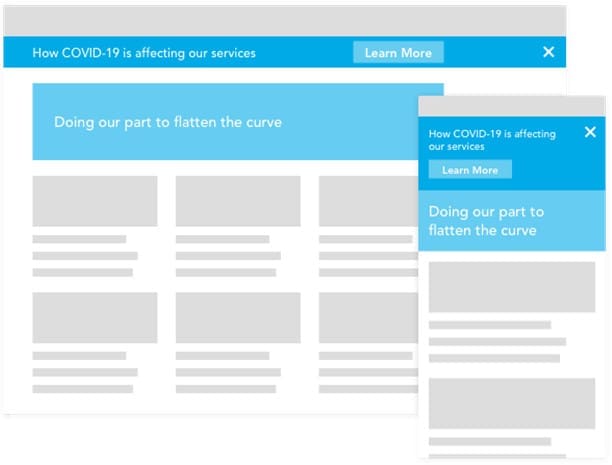
An information bar that is prominent yet non-intrusive, accompanied by a hero.As a note, it is good practice to reduce visual clutter and intrusiveness: don’t overload the user by having multiple elements that they have to go through in order to reach your site’s content. The information bar should be designed small enough to avoid skewing the existing page hierarchy, and be able to collapse or be hidden from view. Always provide options for the user to navigate through the message experience you created, instead of making them feel that they are being forced to read it.
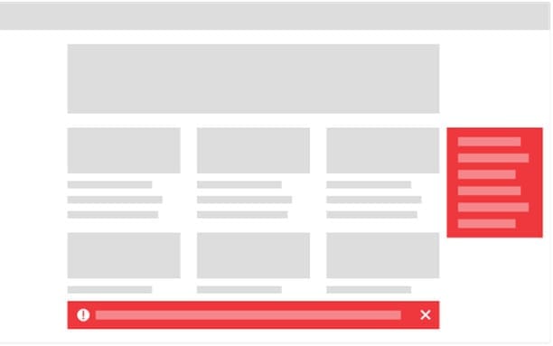
Floating footers and sidebars can be missed, or at a glance be misinterpreted as spam or ads.
Information that is not centralized can be difficult to find.
A pop-up can be too intrusive, especially if it appears every time the user refreshes the site. -
Create a landing page
This page will link from the global information bar you’ve set up and will allow users to find all your updates in one location. It will also help with keyword searches, so users who are looking for specific COVID-19 news from a search engine are able to find it.
Remember that this page should be updated as soon as any new development takes place. Be friendly and empathetic, yet concise. Make it easy for your users to find what they’re looking for without having to endlessly read through paragraphs of community messaging. Also consider adding timestamps or an FAQ section if you have an extensive list of changes or questions that your customers may have. If a user can find what they’re looking for here, it will reduce commonly repeated inquiries, allowing your company to focus resources elsewhere.
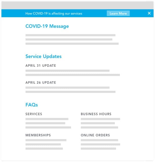
Separate community messaging and FAQs into their own sections, and consider using timestamps if relevant. -
Fill in the gaps and unify the experience
Take a look at your site as a whole and make sure that all content is echoing the same message. If local store hours have been changed, reflect that in their respective store pages. If you’ve frozen all memberships and sign-up options, point it out in your sign-up funnel. Having disparate information littered around the site will reduce the overall effectiveness of the crisis messaging you’ve created, as users will begin to doubt if anything they’ve read is accurate and up to date.
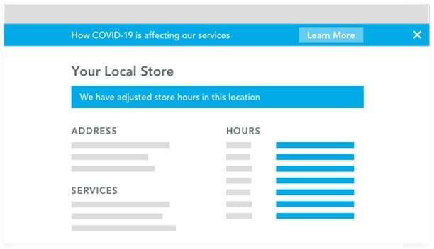
Tie in your website by making sure all information on relevant pages are up to date.And, as always, everything on your desktop site should translate to other touch points such as mobile. A user viewing your website on their phone should have the same access to the information that’s available on desktop. This also applies if you have an app, especially if it is one of the primary means of communication with your users. The interface should be responsive to accommodate various devices, but the experience should remain the same.
Good UX now will pave the way for future growth
UX principles remain the same regardless of situation. Our goal is always to curate seamless experiences across multiple touch points, especially when poor UX makes users 88% less likely to return to a site.
Although times are uncertain right now, things will bounce back, and what you do now can impact how customers view your company in the long run. If customers believe that they can rely on you during tough times, that is earned confidence that will carry on well towards the future.
More than half of consumers feel that brands fail to meet their experience standards, so stand out in the best way by polishing your UX to exceed user expectations. If you need help with finessing your UX strategy, drop us a line. We’re ready to help.

