 2017-web-design-trends
As digital technology is constantly developing and changing, so too is the design that goes with it. Here are just some of the things you can expect to see more of in 2017:
Motion
A picture may be worth a thousand words, but a video is worth a million. Full screen video loops with a powerful message overlaid are a great way to capture the attention of your audience, providing a richer experience than you would get with a static hero image. They are also a great way to instantly showcase your brand without forcing visitors to scroll. Cinemagraphs are also a popular feature designers have been placing more emphasis on; these are static images with one element of the photo animated, like the steam from a cup of coffee or a bird against a skyline, usually appearing in the form of a GIF.

Experimental Compositions
In a world where grid & masonry layouts dominate the web, everything looks the same. Designers are now looking for a new approach to making sure their content stands out amongst the crowd and to inject personality/creativity back into their brands. Open compositions are gaining popularity; they provide you with more freedom, and with elements overlapping/ escaping off-screen, you aren’t confined to just four walls.

However, this doesn’t mean that flat design is dead. Geometric shapes and patterns have become increasingly popular over the past 6-12 months. It seems that more and more designers are incorporating these into their websites, and this trend will only continue to grow in 2017.

Illustration
A lot of designers are taking it old school and adding hand-drawn illustration to their websites/ digital experiences. When you see the same stock images across every website, it gets a bit tedious and all personality is lost. Nowadays, you can spot a stock image like the back of your hand (especially as a designer). Hand drawn artwork brings the human element back into design, something which has been lost in generic layouts and minimalist branding.

Mobile First
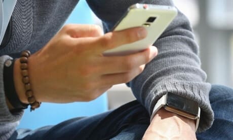
With mobile becoming the primary device for searching the web, a lot of people are adopting the mobile-first approach, building a rich experience for hand held devices and then moving on to desktop. When designing for a smaller device, you really have to break it down and consider what your core message is, and how to communicate it with the space at your disposal. This forces you to trim the fat and lose any unnecessary filler content that would have been included if you had designed your desktop experience first.

Bold & Vibrant Colour
Minimalism has been the key word in design & brand identity over the past few years thanks to Apple & other like minded companies who have stripped their brand down to the bare bones. Consequently, everyone appears to have followed suit and gone ‘back to basics’ with their use of space and colour when building their identity. But the tail end of 2016 saw neutral whites, greys & blacks traded in for more bold & vibrant colours. Gradients and duotones have also resurfaced in a big way in recent months, which I hope to see more of in 2017.


Visual Storytelling
Gone are the days of slapping a contact form on your site and hoping that your customer will get in touch. In an over saturated market, it is more important now than ever to build a relationship and create a narrative through your website; that is why you have one after all, to communicate your message and hope that it connects. Storytelling is the oldest trick in the book, yet the most effective.


