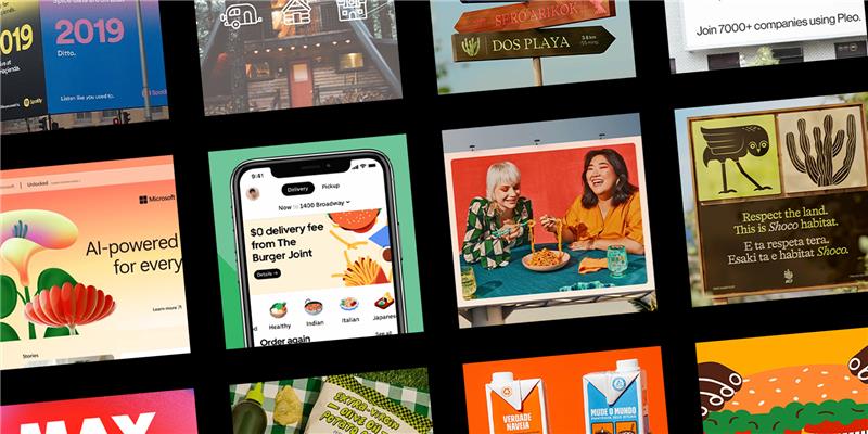
Delight your audiences as they move through the journey to purchase with creative that matches their intent, aligns with strategic insights.

Differentiating your brand from others is absolutely essential to business survival. To mark your product out as the best, most luxurious or even cheapest is to stand out amongst the pack. But there are ways other than product to mark yourself apart. Even the simplest of logos can become powerful brand identifiers. Recent years have seen a dramatic shift in branding, gone are the days of over elaborate brand identities, stripped back in favour of a simplistic style. 2015 saw some major brands redesign their visual identities. The Swoosh, bitten apple, little blue bird. We all know what they mean. They have become such powerful indicators of brand identity that often the brand name becomes surplus to requirement. To test this theory I’ve stripped back some brand logos below, can you identify them form purely shape and colour? Go to the bottom of the page to see how many you got correct 
A sign, symbol or trademark which conveys the identity or ownership of a product, company, or concept in as easily memorable a way as possible is the blueprint for a successful brand logo. Over the last century, the world around us has gradually become more complex, with attention spans being spread ever more thinly across multiple devices. Brands trying to capture our attention are struggling. Making the identification process as seamless and easy as possible is a sure fire way to beginning to get your brand recognised. While a lot of companies fall short in visually expressing a brand’s values and principles. One that hits the nail on the head is Nike  The Nike swoosh is one of the, if not the, most recognisable and identifiable logos in the world. “The tick being a symbol of affirmation, literally telling the consumer yes you can, or to use the correct jargon, “Just Do It”. Fast” and “fluent” are two words which immediately come to mind. The power behind these two words helped it become one of the most striking sports insignias worldwide. It is minimalism at its finest. While many companies such as Pepsi and the BBC will stop at nothing to create the perfect logo, using the world’s best branding agencies, and spending millions of dollars, the Nike swoosh was designed by graphic designer Carolyn Davisdon in 1971 for a total of $35. Phil Knight, co-founder and chairman of Nike, initially didn’t like the logo. “I don’t love it, but it’ll grow on me”, he is quoted as having said at the time. Almost a decade later, after having seen the success of the brand, Carolyn Davidson was invited to lunch by Nike where Phil Knight gave her an envelope containing Nike stock. A fair compensation for one the world’s most recognizable logos. A logo that received a lot of criticism, both from the press and consumers, was the Pepsi logo. This was revamped by New York-based Arnell Group for $1 million. The new design featured a “smile”, in place of the classic white line everyone identifies with. with a less formal rounded lowercase typeface.
  And it wasn’t just Pepsi. 2015 also saw the return of lower-case. It was thought that having an upper-case logo was stronger and more prominent than the playfulness of lower-case type, but many brands have now adopted lower-case typefaces in their logos in a bid to be more personable and friendly, while also aiming to appear softer and sleeker.
Subscribe to our monthly newsletter.
With the current trend of redesigns, the clear pattern is one of absolute simplicity. Brands have stripped back their colour palette , got rid of their three-dimensional elements and gone back to basics. It has been argued that they are taking the personality out of their brands and conforming to today’s trends. While others say that they are evolving with the times and becoming sleeker/ more streamlined. You’ll find me in the latter camp. A successful example being Google’s recent re-brand. At first, it was thought that their new logo looked too bland and childish because of its curvy characters and flat style. But once people gave it some time and research, the message it was conveying became a lot clearer. Below are the full logos. How many did you get right? 
Delight your audiences as they move through the journey to purchase with creative that matches their intent, aligns with strategic insights.
Delight your audiences as they move through the journey to purchase with creative that matches their intent, aligns with strategic insights.
Subscribe to our monthly newsletter.