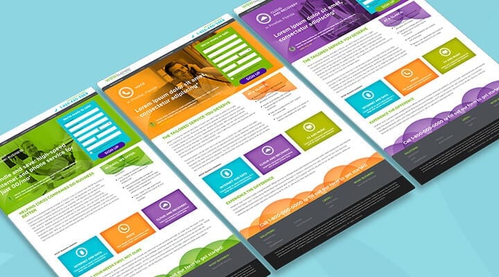
Our in-house Dev Studio covers every critical discipline, giving DAC the knowledge and skill to repeatedly deliver data-informed.

Whether it’s on a mobile, desktop or tablet device, landing page experiences can make or break your campaign. Staying abreast of best practices, understanding how your audience uses your pages and testing all the time will ensure you maintain the highest conversion rates from your pages.
Humans have high expectations of brands – let’s not let them down!
Screwing up landing pages impacts bottom line.
Landing pages sit at the core of your conversion process and they aim to serve one purpose – get a user to take a desired action. Unfortunately, that’s not as simple as it sounds; if it were, average conversion rates wouldn’t be in the single-digits. So, how do you create seamless landing page experiences that lead to action? The simplest answer is to eliminate elements hindering conversion rates.
Irrelevant Content
You might have a beautiful ad. It might be immaculately placed in front of the right person at the right time. That will hopefully earn your landing page a visit. But if your destination page doesn’t fulfill on brand promise, your response from users will be anticlimactic.
Getting relevancy right means creating a seamless experience and delivering a page the user expects to see. If your ad was for “men’s camouflage cargo shorts”, you won’t impress a page visitor by touting 15 different styles of cargo pants and a variety of shorts. Your headline, description and images should be a continuation of the ad that got them there in the first place.
When someone is searching for something specific, the best practice is to isolate that product or service and float it to the top so its front-and-center. Doing this creates trust and comfort, along the desired conversion path.
Clutter
Clean, simple landing page design with a sensible balance of content and white space wins every time. This helps the user easily find and absorb what they are looking for without any frustration. The practice of promoting every product and service a brand offers is disruptive; modern marketers need to be adaptive. Today’s consumers know what they want. The most effective landing pages are about answering the query, not just advertising. By keeping landing page design focused mainly on a single goal brands can better connect relevant in-time content with users most likely to convert.
Slow Load Times
Did you know that Amazon recorded a 1% increase in revenue for every 100 milliseconds they improved their site speed? Walmart saw a 2% increase in conversion for every one second of improvement.
Subscribe to our monthly newsletter.
Convinced?
Page load time is an underestimated element in landing pages. Consumers have high expectations and short attention spans – every millisecond lost increases the chance of page abandonment. How fast do your landing pages load?
Poor Content Balance
Content is not always a long paragraph of well-written words. More and more we’re seeing less and less copy. The right content addresses and answers a user’s question, specifically expresses your solutions benefits and highlights a clear call to action for visitors.
Sure, that might include some descriptive text. But it may be an ideal opportunity to incorporate images, videos, white paper downloads, etc. to raise the bar for your brand’s relevancy. Think about who you’re looking to attract and convert. What are they actually looking for when they hit your landing page? Audience research and testing are two effective ways you can answer that question.
Testing is an imperative process to help you understand what’s working on your landing pages and what could be working better. You should be testing every element of your page with a systematic A/B approach – using a control and a variation. This will help you clearly understand what’s working, what could be working better and what’s not working at all.
Lack of Responsive and Mobile-Friendly Design
Mobile devices made up 30% of traffic and 15% of web sales in 2013. That stat is surging like a tidal wave. If you’re not thinking mobile, your competitors are.
A good mobile landing page has a clean design that adapts to the user’s screen (be sure to implement a device detection program). The design should inhibit any confusion; mobile isn’t the place to cram in content.
The most important element to converting mobile traffic is a clear and easy call-to-action. Whether that’s a phone number, an address or a product, it should be completely intuitive to the user. Overall mobile conversion rates are still low – the better we get as marketers, the more profitable the channel will become.
Do you have tried and true tips for improving landing page conversion? Share your advice in the comments below.
If you are interested in finding out more? Contact us today!
Our in-house Dev Studio covers every critical discipline, giving DAC the knowledge and skill to repeatedly deliver data-informed.
Our in-house Dev Studio covers every critical discipline, giving DAC the knowledge and skill to repeatedly deliver data-informed.
Our in-house Dev Studio covers every critical discipline, giving DAC the knowledge and skill to repeatedly deliver data-informed.
Subscribe to our monthly newsletter.